Years in UI/UX
Designing mobile products, web platforms, and service journeys since 2022.

Ambiguous journeys, dense requirements, interface systems, responsive delivery, and the conversion details that make a digital experience useful to the business.
Designing mobile products, web platforms, and service journeys since 2022.
Fintech, healthcare, education, tourism, community, and recruitment.
From flow architecture and interface systems to frontend and growth.
Available for full-time, contract, and cross-functional opportunities.
Ideas from the work
Notes on product design, fintech UX, responsive delivery, digital strategy, and making expertise discoverable in AI search.
View the full journalA practical framework for making regulated onboarding clear, progressive, and trustworthy without weakening compliance.
How to move from a messy service problem to a coherent interface without jumping straight into polished screens.
A practical guide to translating design intent into responsive, accessible frontend behaviour instead of brittle pixel copies.
How journey thinking, message continuity, and better measurement turn campaign activity into a coherent growth system.
A grounded guide to publishing clear, attributable, crawlable expertise for search engines and AI answer systems.
How deliberate interface language prevents confusion, lowers support volume, and makes products feel more trustworthy.
Why speed and resilience on slow or intermittent connections should be designed deliberately, not left to optimisation at the end.
A structured approach to writing design case studies that show judgement and outcomes instead of a gallery of final screens.
A practical guide to helping a local service business appear in nearby searches through profile, content, and trust signals.
How to measure the impact of product design in a way that is honest, defensible, and useful for making decisions.
10 case studies spanning regulated onboarding, lending, transactional web, healthcare, travel tech, tourism, community, and campaigns.
Product design · UX/UI · Flow architecture
Case study
The challenge
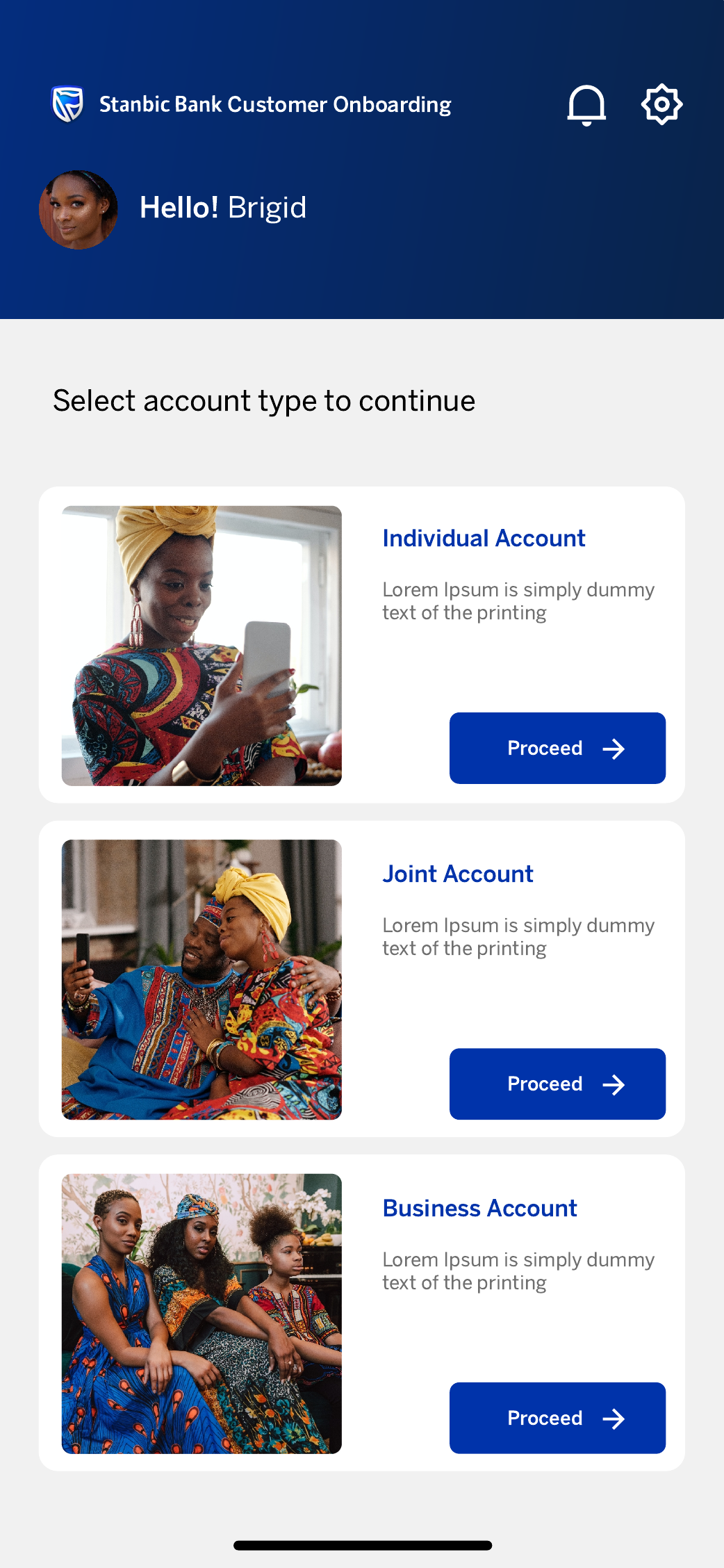
Opening a bank account asks customers to make product choices, verify contact details, submit identity evidence, share personal information, and confirm everything accurately. The risk was a long, compliance-heavy process that felt opaque or overwhelming.
My approach
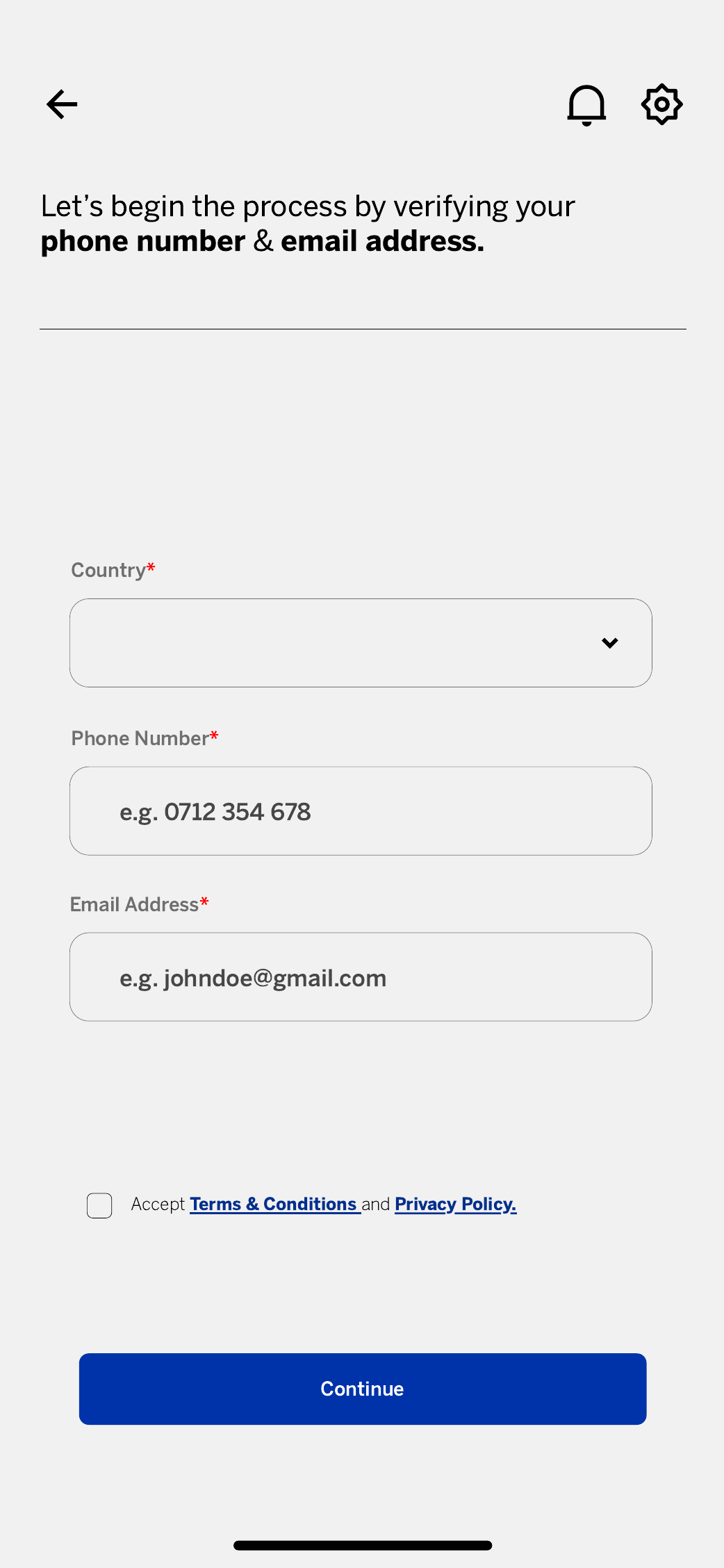
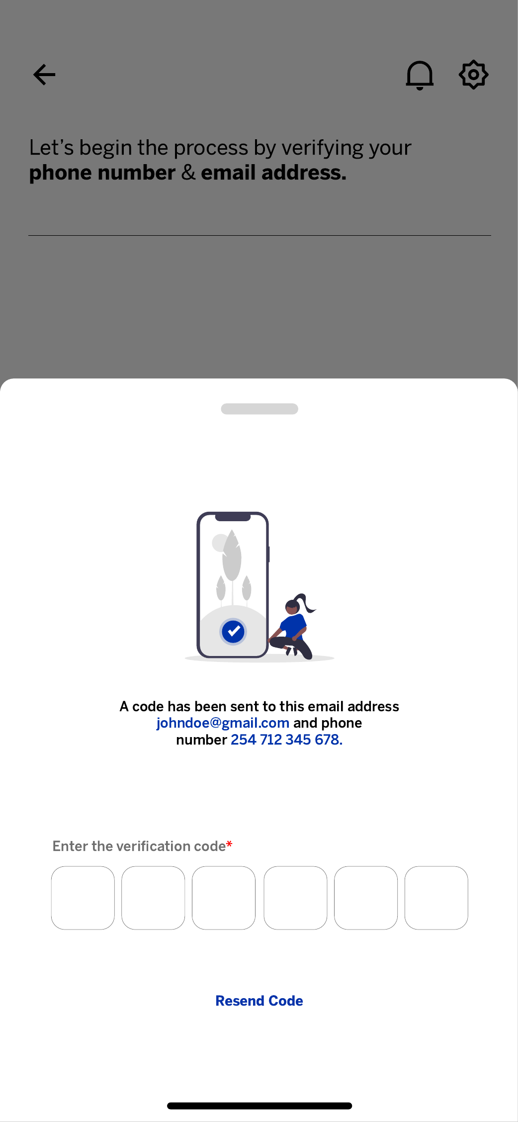
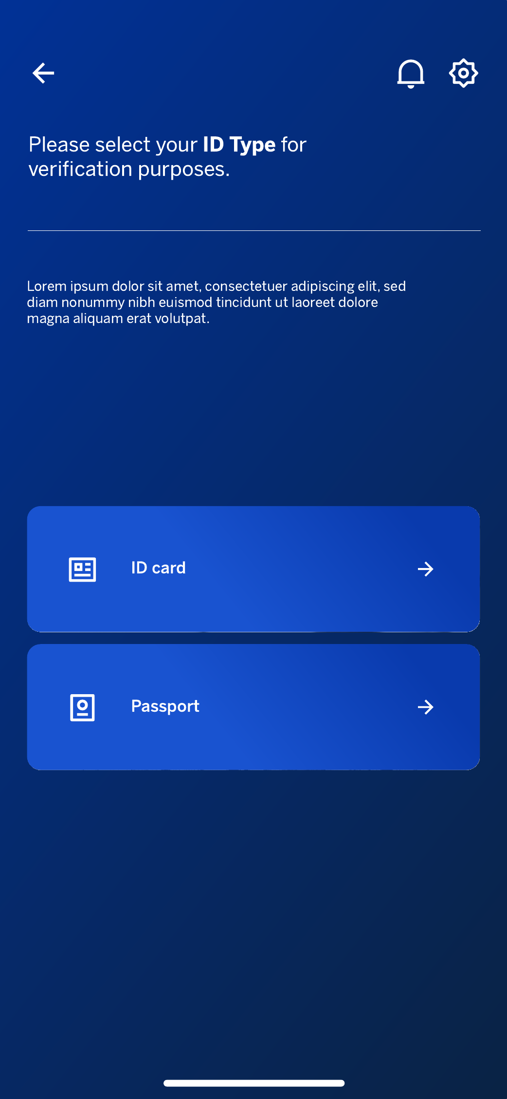
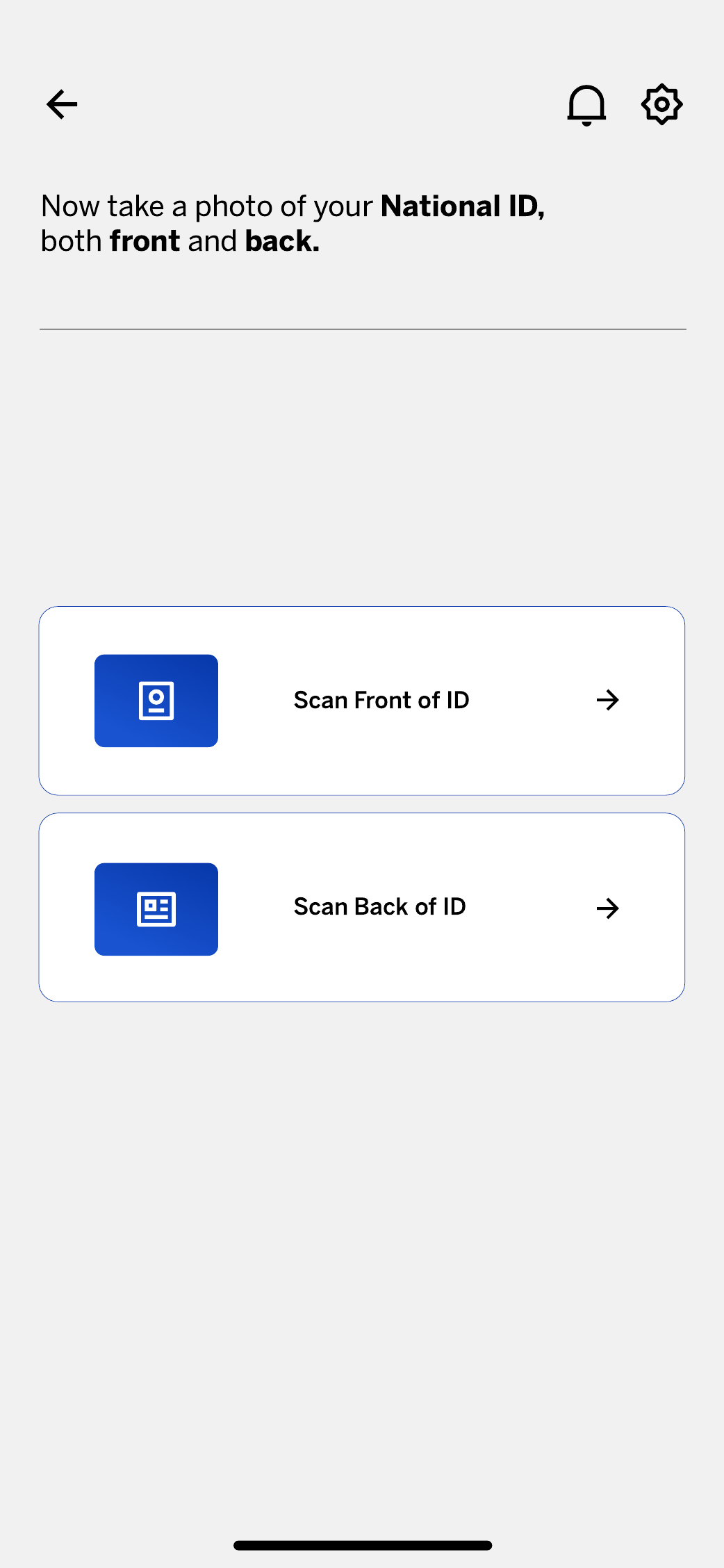
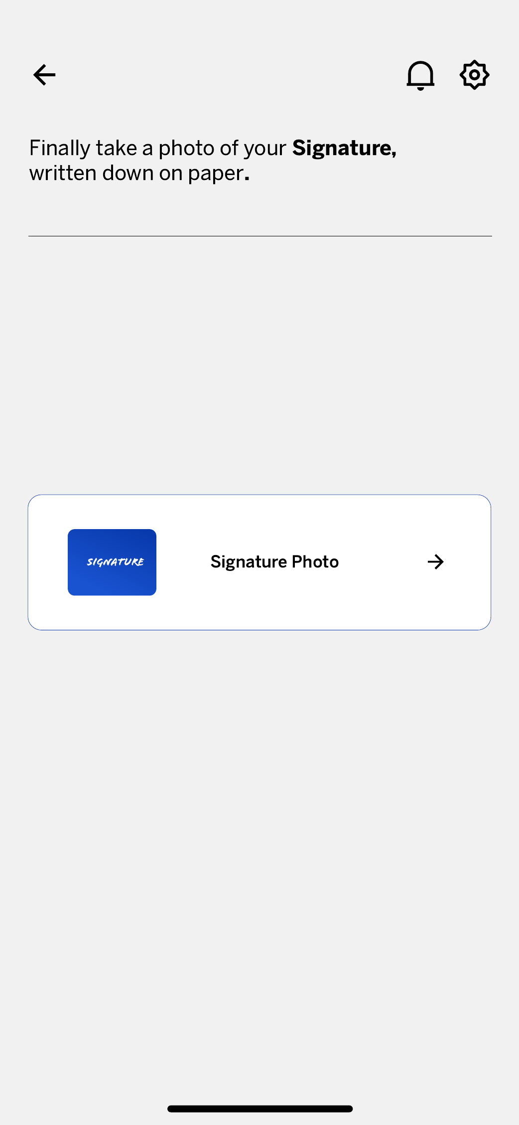
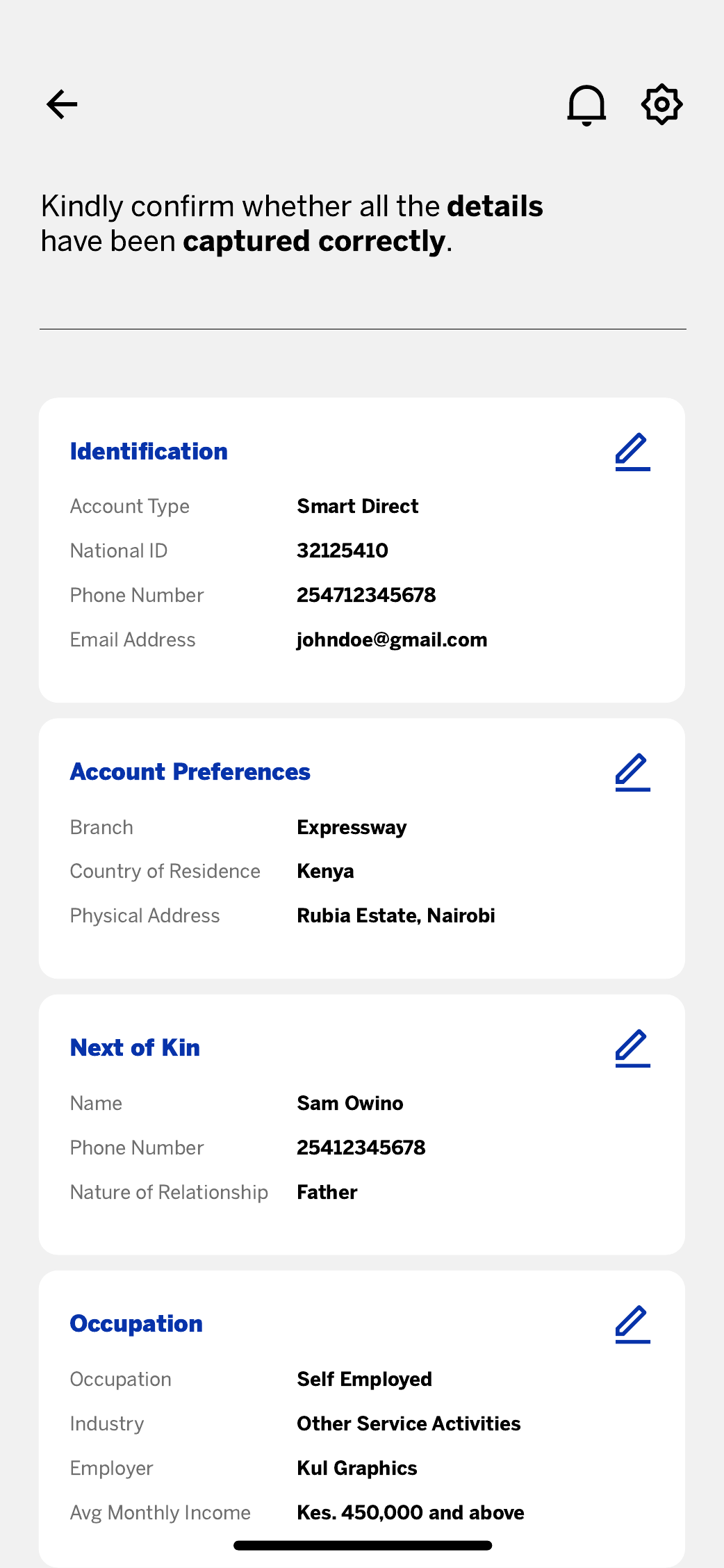
I broke the journey into clear commitments: choose an account, understand requirements, verify contact details, capture ID and signature, add preferences and personal data, then review editable sections before submission. Each screen asks for one meaningful decision and keeps progress focused.
The outcome
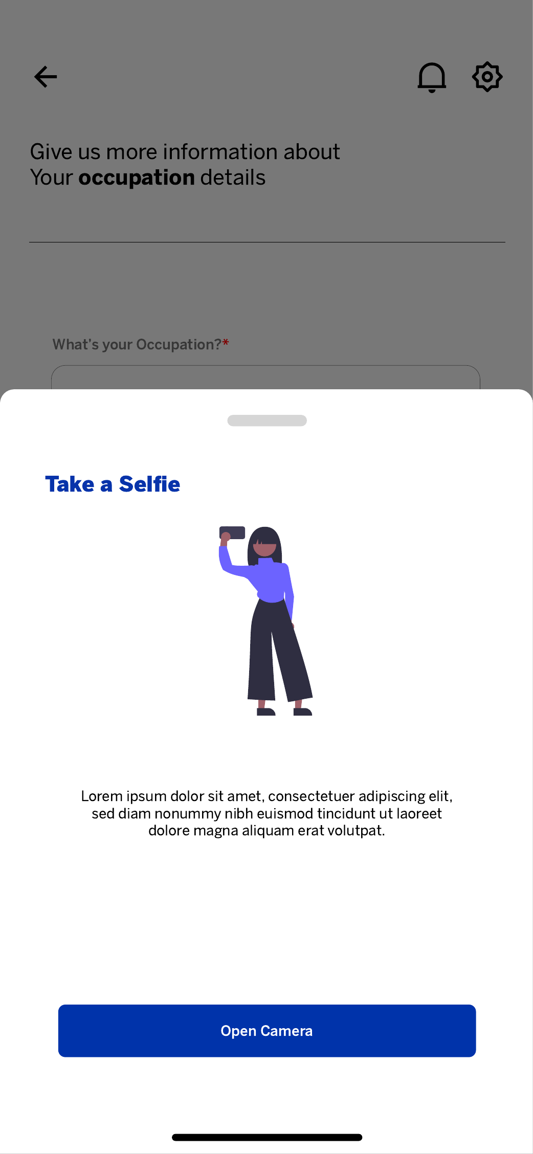
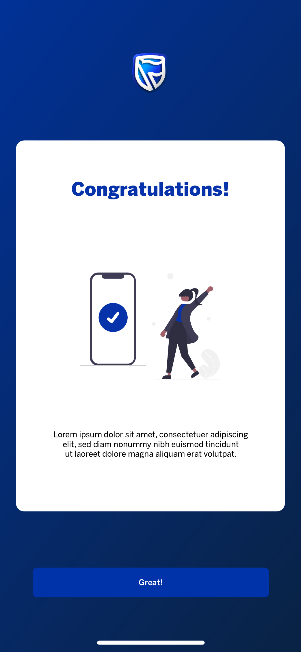
The concept demonstrates a complete onboarding path across individual, joint, and business account entry points, OTP verification, ID and KRA handling, next-of-kin and occupation data, selfie capture, review, and confirmation.
Design journey
How this product moved from regulatory requirements to a shipped-quality interface — the thinking between the blank page and the final screens.
Who is opening this account, and what do they fear mid-form?
A compliance-heavy journey that feels opaque loses customers before submission.
Staged commitments — one meaningful decision per screen.
Grayscale structure first, branded flows second.
Walkthroughs against drop-off points, edge cases, and error states.
I started with the non-negotiables: the KYC and compliance data the bank must collect, and where account-opening journeys typically lose people. Reviewing existing onboarding patterns surfaced the same failure — everything asked at once, with no sense of progress.
Before any UI, I mapped all 17 screens into staged commitments and sequenced the sensitive asks — ID, KRA, selfie — after early wins, so momentum is built before trust is tested.
Grayscale wireframes locked hierarchy, form density, and button placement while structure was still cheap to argue about. Fields moved between screens here, not in polished mockups.
With structure agreed, I applied Stanbic's visual language and designed the states a regulated product needs to feel safe: validation, errors, an editable final review, and clear confirmation.
The problem statement
Customers abandon account opening when a regulated, document-heavy process asks for everything at once and gives nothing back — no progress, no explanation, no way to fix mistakes.
How might we…
What the experience audit found
Existing onboarding flows asked for identity, preferences, and documents in one unbroken form.
Chunk by commitment, not by database table.
Validation failures often appeared only at final submission, forcing restarts.
Validate inline, at the moment of entry.
ID and KRA requests arrived without any explanation of why, or what happens next.
Pair every sensitive ask with a plain-language reason.
Who I designed for
24 · First salaried job · Nairobi
The first-account graduate
“Just tell me what you need from me upfront.”
38 · Operations lead · Switching banks
The time-poor professional
“If I can't see the finish line, I quit.”
45 · Shop owner · Business account
The small business owner
“I want to check everything before I press submit.”
Empathy map · Wanjiku — the first-account graduate
The emotional journey
Doing
Compares individual, joint, and business account options.
Thinking
“Which one actually fits me?”
Design opportunity
Card-based comparison
Doing
Enters phone and email, confirms the OTP.
Thinking
“That was quicker than I expected.”
Design opportunity
Instant OTP + inline validation
Doing
Scans National ID front and back, takes a selfie.
Thinking
“Is my data safe here?”
Design opportunity
Explain why each document is needed
Doing
Adds KRA, occupation, and next-of-kin information.
Thinking
“How much more is left?”
Design opportunity
Short grouped forms, visible progress
Doing
Checks every section and edits directly in place.
Thinking
“Good — I can fix that myself.”
Design opportunity
Editable sections before commitment
Doing
Submits and receives clear confirmation.
Thinking
“Done. I know what happens next.”
Design opportunity
Explicit next steps
Walkthroughs & iteration
FoundIn walkthroughs, the review screen read as final — people hesitated to touch anything on it.
FixedEvery section gained a visible edit affordance, and edits return to the review, not the start.
FoundThe ID step raised the same question every time: “why both sides?”
FixedAdded plain-language reasons and clear captured/pending states for each scan.
FoundAcross 17 screens, progress felt invisible.
FixedStaged the journey into named commitments so each step visibly closes a chapter.
Designed to move
Reduce abandoned applications by shrinking the perceived effort of each screen.
Cut re-submissions and support calls with an editable final review.
Lower drop-off at the identity step by explaining every sensitive ask.
The mapped flow
Low fidelity → high fidelity
Research artifacts — personas, empathy map, journey map, audit and walkthrough notes, and low-fidelity frames — are illustrative reconstructions of the design thinking behind the shipped screens, redrawn for this case study.
Product design · UX/UI · End-to-end journey
Case study
The challenge
Vehicle finance stretches far beyond a single application form. Customers need to understand eligibility, register securely, provide asset and seller details, review costs, generate an offer, submit fulfilment documents, and follow progress after applying.
My approach
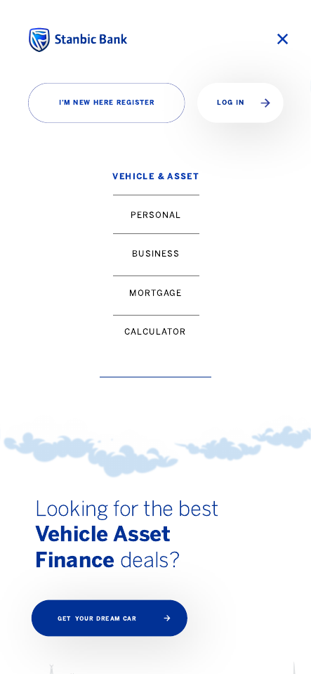
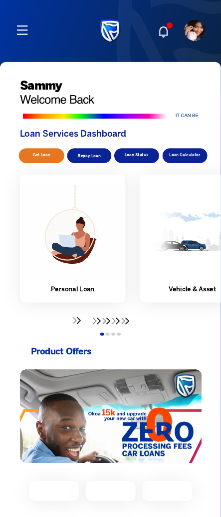
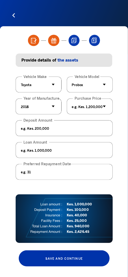
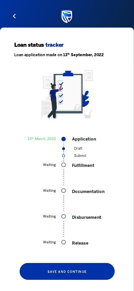
I designed the experience as one continuous service: a clear product landing page, registration and secure access, a loan dashboard, staged asset and seller forms, financial summaries, confirmation, document checklists, notifications, support, and a visible status tracker.
The outcome
The resulting concept covers the full relationship from first interest to release, giving customers context at every stage and giving delivery teams a structured map of the states, data, documents, and handoffs the service requires.
Design journey
How a fragmented finance process became one legible service, from first interest to asset release.
Follow the customer beyond the application form.
The real problem is uncertainty across handoffs, documents, and time.
Treat discovery, application, fulfilment, and tracking as one service.
Map the state model before polishing 23 screens.
Walk every branch for missing documents, delays, and recovery.
I framed the journey from product discovery through asset release, including bank, dealer, and customer handoffs.
Application, offer, fulfilment, review, and release became named states with ownership and next actions.
Wireframes tested dense financial summaries, checklists, and tracker hierarchy before brand treatment.
The final interface uses familiar banking patterns while keeping totals, status, and support visible.
The problem statement
Vehicle-finance customers lose confidence when eligibility, seller details, fulfilment documents, and approval status live as disconnected tasks with no dependable view of what happens next.
How might we…
What the experience audit found
Comparable flows focused on form completion and largely disappeared after submission.
Design the relationship through fulfilment and release.
Checklists named documents without clarifying owner, format, or timing.
Turn requirements into assigned, status-aware tasks.
Dealer, bank, and customer actions were mixed into one generic status.
Name the actor, action, and next dependency.
Who I designed for
36 · Logistics manager · Nairobi
The first-time vehicle buyer
“I can wait. I just need to know what I am waiting for.”
42 · SME owner · Kisumu
The working-capital protector
“Show me the total commitment, not only the monthly figure.”
Empathy map · Moses — the first-time vehicle buyer
The emotional journey
Doing
Reviews finance options and eligibility.
Thinking
“Could this work for me?”
Design opportunity
Plain-language eligibility
Doing
Creates a secure profile.
Thinking
“Keep this quick.”
Design opportunity
Short secure entry
Doing
Adds asset, seller, and income details.
Thinking
“This is a lot to coordinate.”
Design opportunity
Staged ownership
Doing
Checks deposit, tenor, fees, and repayment.
Thinking
“What is the full commitment?”
Design opportunity
Complete cost summary
Doing
Uploads outstanding documents.
Thinking
“Whose document is missing?”
Design opportunity
Assigned checklist
Doing
Follows approval and release.
Thinking
“At least I can see movement.”
Design opportunity
Timestamped tracker
Doing
Receives completion and next-step guidance.
Thinking
“I know what happens now.”
Design opportunity
Explicit closeout
Walkthroughs & iteration
FoundPeople read a generated offer as final approval.
FixedSeparated indicative offer, submitted application, and approved states with explicit language.
FoundThe fulfilment list did not reveal whether the customer or seller owned a task.
FixedAdded actor labels, status, and the blocking dependency to every item.
FoundA single progress bar hid long waiting periods.
FixedReplaced it with a timestamped milestone tracker and a visible next action.
Designed to move
Increase the share of customers who reach submission with all required information.
Reduce avoidable document follow-ups by making task ownership explicit.
Reduce status-chasing contacts with a useful post-application tracker.
The mapped flow
Low fidelity → high fidelity
Research artifacts and low-fidelity frames are illustrative reconstructions of the design rationale behind the presented interface, redrawn for this case study.
Product design · UX/UI · Design system
Case study
The challenge
The product had to explain loan logic without overwhelming customers and remain usable across different devices, languages, and levels of connectivity in Kenya.
My approach
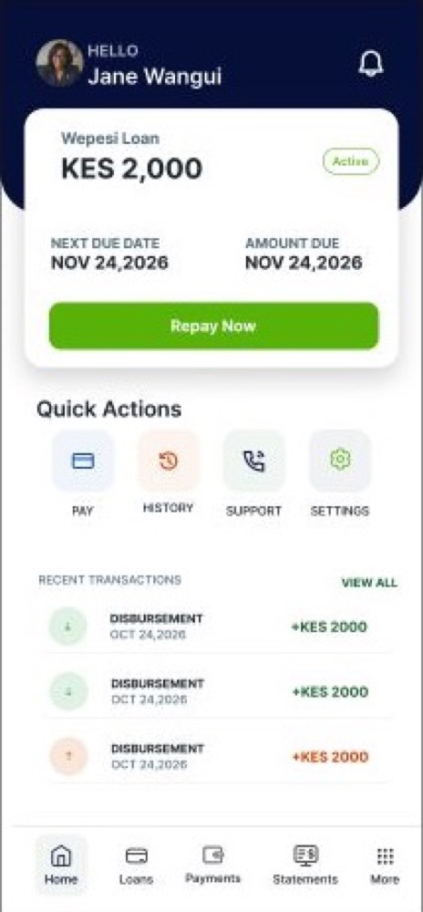
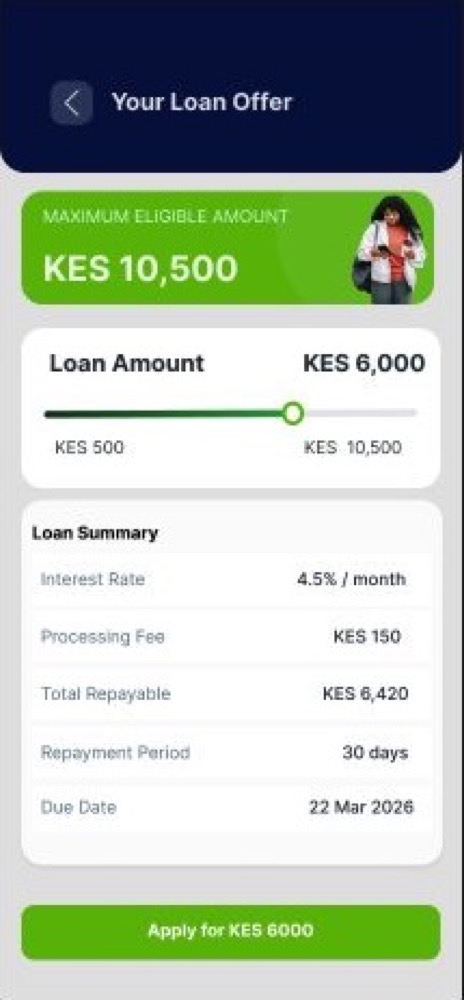
I designed the Android and iOS experience alongside a USSD path, keeping the same mental model across both. Loan application, check-off loan, validation, error, and edge-case states were made explicit, with English and Kiswahili content considered from the start.
The outcome
The v1.0 package created a coherent product foundation for app and low-bandwidth use: a reusable visual system, complete core journeys, USSD wireframes, bilingual variants, and handoff-ready interaction states.
Design journey
How loan logic, low-bandwidth access, and bilingual content were aligned into one consistent product model.
Design for uneven connectivity, varied devices, and different levels of financial confidence.
A trustworthy loan product must explain decisions, not only display them.
Use one mental model across app and USSD.
Prototype core, error, and low-connectivity states together.
Check comprehension in English and Kiswahili, not visual polish alone.
Connectivity, device range, language, and financial confidence shaped the journey before interface decisions.
The app and USSD paths were mapped from the same stages, terminology, and decision logic.
Core screens were developed alongside timeouts, validation, ineligibility, and resume behavior.
A bilingual visual and content system carried the same meaning across products and platforms.
The problem statement
Borrowers struggle to make confident loan decisions when eligibility, costs, validation, and repayment logic change across channels or depend on language and connectivity.
How might we…
What the experience audit found
Mobile and USSD flows often used different labels and step order.
Build both channels from one journey model.
Failed eligibility or validation states explained the result but not the next move.
Every decision state needs a recovery path.
Translated interfaces preserved words but lost clarity and natural phrasing.
Design and test meaning in each language.
Who I designed for
31 · Trader · Mombasa
The mobile-first borrower
“Tell me the amount I will repay before I agree.”
47 · Farmer · Murang’a
The USSD-reliant customer
“The steps should mean the same on my phone.”
Empathy map · Juma — the mobile-first borrower
The emotional journey
Doing
Reviews eligibility and products.
Thinking
“Which loan fits?”
Design opportunity
Comparable product language
Doing
Provides purpose and requested amount.
Thinking
“Keep the steps short.”
Design opportunity
Progressive questions
Doing
Responds to checks and missing data.
Thinking
“What should I fix?”
Design opportunity
Actionable validation
Doing
Checks offer, fees, and repayment.
Thinking
“Can I manage this?”
Design opportunity
Plain totals and schedule
Doing
Accepts terms and receives next steps.
Thinking
“I understand the commitment.”
Design opportunity
Consistent confirmation
Walkthroughs & iteration
FoundA direct translation of repayment language sounded formal and unclear in Kiswahili.
FixedRewrote the concept around familiar actions and tested both language variants side by side.
FoundUSSD users lost context when a session timed out.
FixedShortened menus and added a clear resume point using the same stage names as the app.
FoundDeclined and validation states felt final.
FixedSeparated fixable input issues from eligibility outcomes and supplied a next action for each.
Designed to move
Increase correct understanding of total repayment, schedule, and decision status.
Reduce confusion when customers move between the app and USSD.
Increase successful continuation after validation errors or interrupted sessions.
The mapped flow
Personas, audit observations, walkthrough notes, and journey mapping are case-study reconstructions based on the documented product scope; no unverified performance claims are presented.
UX/UI design · Responsive web · Transaction flow
Case study
The challenge
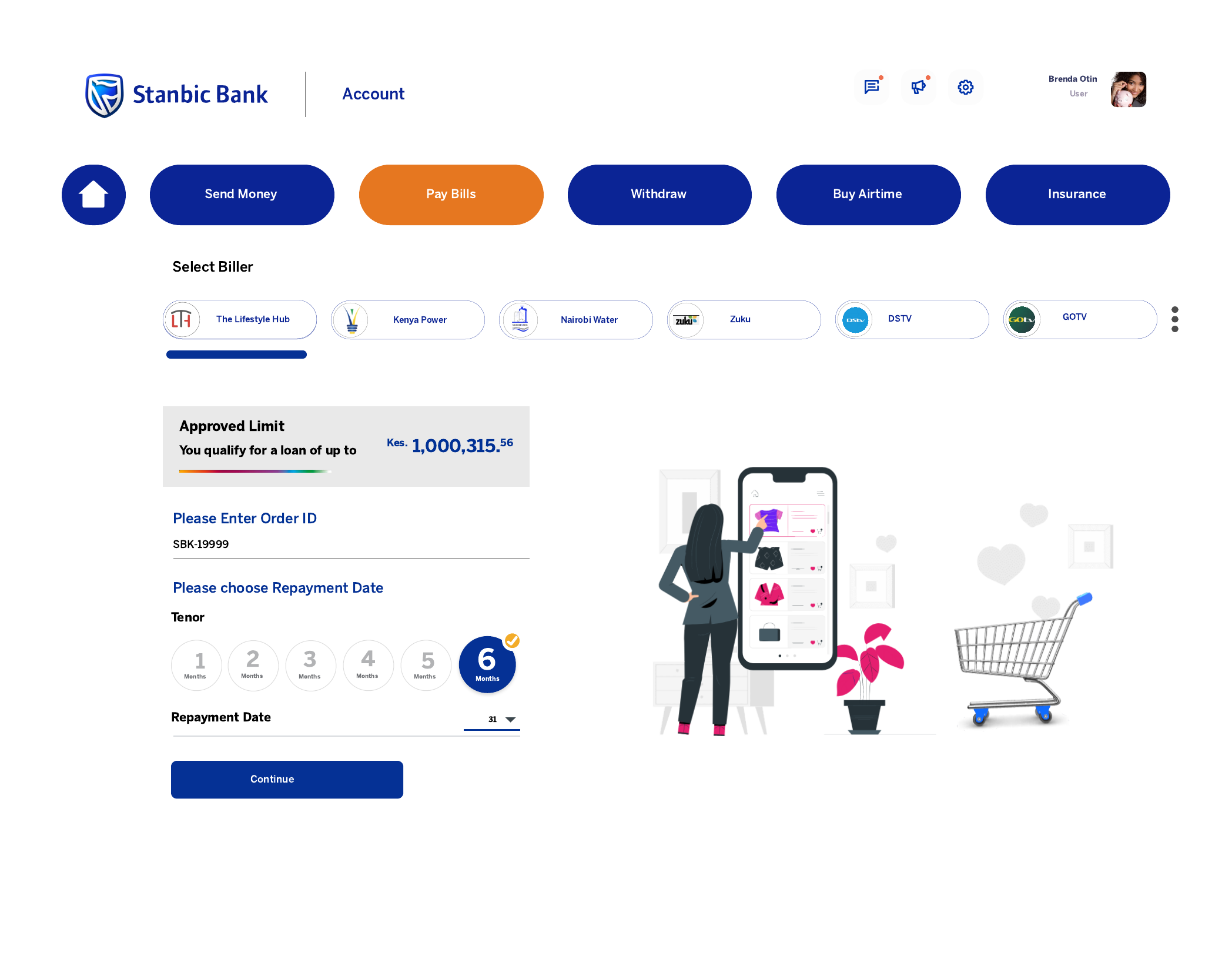
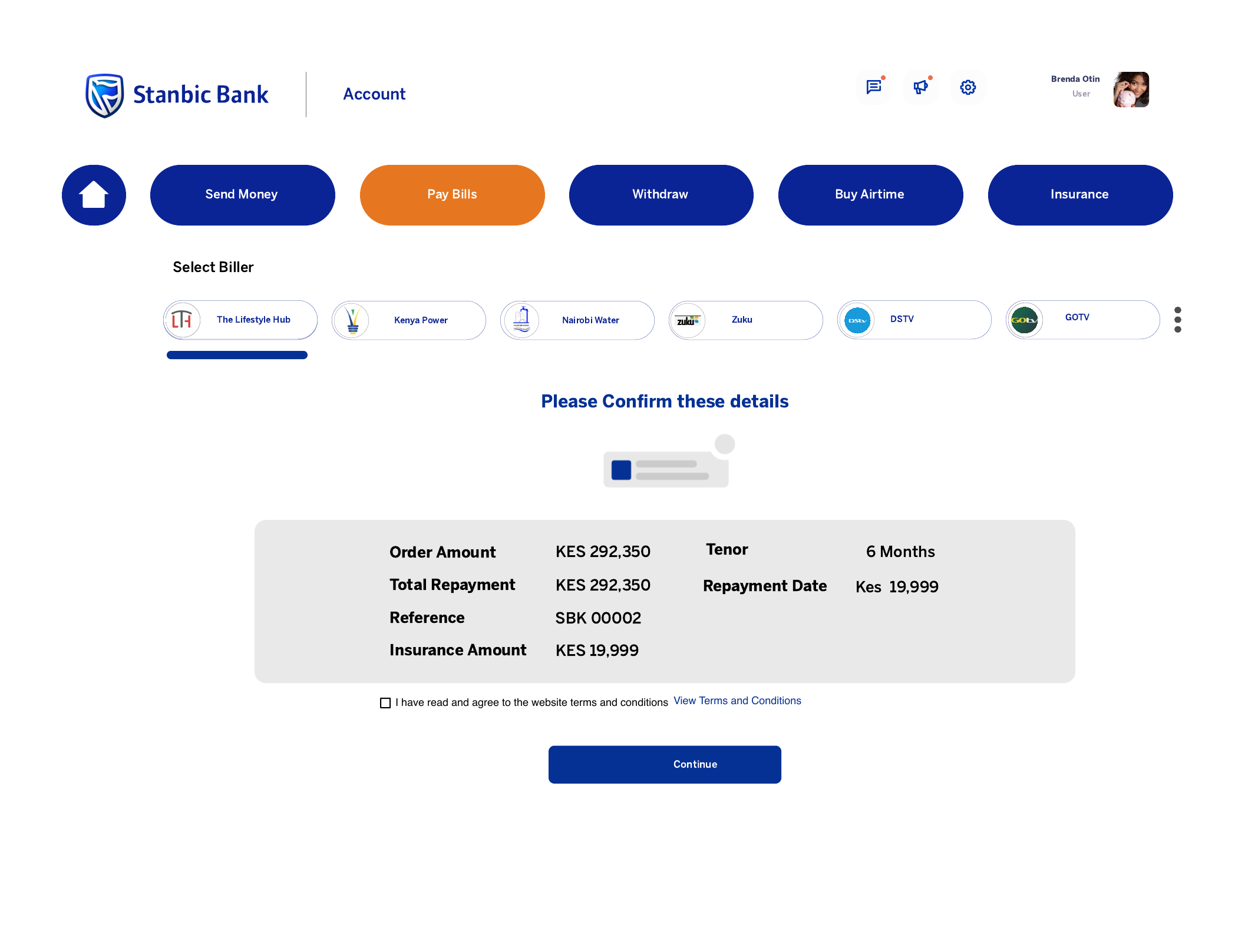
The experience needed to connect a customer’s approved limit with a real purchase while making order reference, tenor, repayment date, cost, insurance, and terms understandable before commitment.
My approach
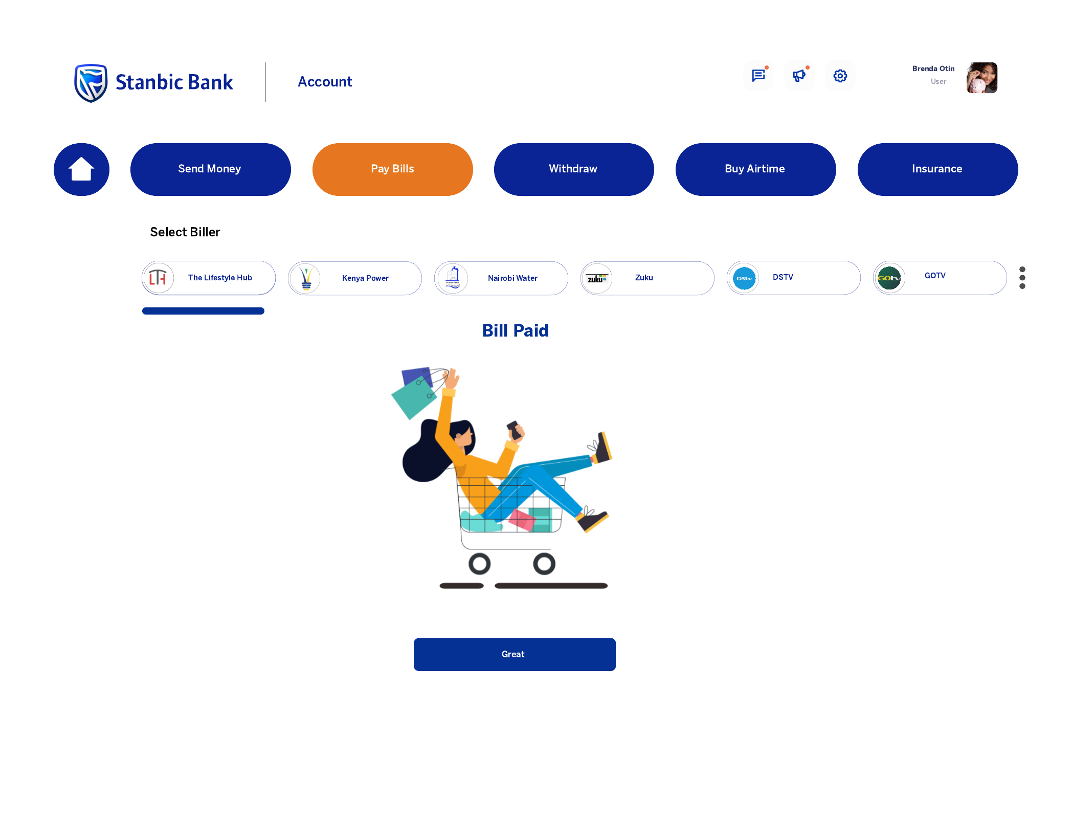
I kept the flow deliberately compact: enter the order ID, choose a repayment period and date, review the complete financial summary, accept terms, and receive a clear paid state. The layout keeps the active task visually dominant inside a broader banking interface.
The outcome
The four-state web concept gives customers a predictable path from eligibility to confirmation, reducing ambiguity at the points where financial commitment and transactional trust matter most.
Design journey
How a loan-linked purchase was reduced to the few decisions customers need before committing.
Understand what makes a customer hesitate at payment.
The core risk is committing without understanding the total cost.
Keep order, repayment, review, and success as four distinct states.
Test the hierarchy in desktop and narrow web layouts.
Walk through cost comprehension, terms, and recovery.
I mapped the information customers need to trust a loan-linked purchase and where it should appear.
The journey was compressed to order, terms, full review, and completion.
Low-fidelity layouts tested the transaction inside a broader banking interface at multiple widths.
High-fidelity states make totals, terms, actions, and success unmistakable.
The problem statement
Customers cannot confidently use an approved loan limit when the purchase reference, repayment timing, insurance, and total cost compete for attention at the moment of commitment.
How might we…
What the experience audit found
Repayment options emphasised the instalment while de-emphasising the total cost.
Show instalment and total commitment together.
Order details, dates, fees, and terms appeared in separate regions.
Consolidate every commitment into one review.
Success states confirmed action without explaining payment or repayment next steps.
Close the loop with a useful receipt state.
Who I designed for
29 · Salaried customer · Nairobi
The convenience buyer
“I want to know exactly what leaves my account and when.”
40 · Parent · Kiambu
The careful planner
“Let me review the whole agreement on one screen.”
Empathy map · Grace — the careful planner
The emotional journey
Doing
Adds the merchant order reference.
Thinking
“Is this the right purchase?”
Design opportunity
Immediate order validation
Doing
Chooses tenor and repayment date.
Thinking
“Which option fits my month?”
Design opportunity
Comparable options
Doing
Checks cost, insurance, and terms.
Thinking
“Show me every shilling.”
Design opportunity
Single commitment summary
Doing
Accepts terms and authorises payment.
Thinking
“I am ready.”
Design opportunity
Unambiguous primary action
Doing
Receives payment confirmation.
Thinking
“I have proof and know what follows.”
Design opportunity
Receipt plus next steps
Walkthroughs & iteration
FoundPeople compared tenor using only the monthly repayment.
FixedPlaced the total repayment beside every option and repeated it in review.
FoundThe review action was mistaken for immediate payment.
FixedSeparated review and authorisation with explicit button labels and state headings.
FoundThe original success message did not confirm the order reference.
FixedAdded the merchant reference, amount, repayment date, and a clear record action.
Designed to move
Increase correct recall of total repayment and first repayment date.
Reduce backtracking at review by making all terms visible together.
Reduce repeat attempts and support contacts after a successful payment.
The mapped flow
Low fidelity → high fidelity
Research and low-fidelity artifacts are illustrative reconstructions of the reasoning behind the supplied final screens, redrawn for this portfolio narrative.
Web design · Frontend · Digital strategy
Case study
The challenge
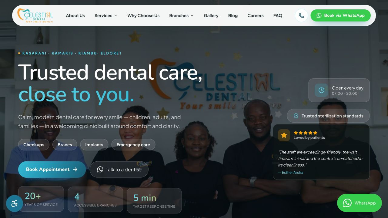
Dental care is personal and often urgent. The website needed to help families understand a wide service range, choose a nearby branch, and reach the care team without adding friction or anxiety.
My approach
I organised the experience around the questions patients ask first: Can I trust this clinic? Is the service I need available? Where can I visit? How quickly can I book? Clear service routes, branch context, social proof, and persistent appointment actions keep those answers close.
The outcome
The finished experience presents Celestial as a modern, approachable multi-branch practice. Appointment and WhatsApp paths remain prominent while service, safety, opening-hour, and location information build confidence before the first visit.
Design journey
How patient anxiety, local intent, and clinic trust signals shaped a website built around booking care.
Start with the questions an anxious patient asks before calling.
The site must build enough trust to make the next action feel safe.
Organise around care needs, branch choice, and appointment intent.
Prototype the homepage as a decision path, not a brochure.
Check whether patients can find service, branch, and contact routes quickly.
Search intent, enquiries, and common patient concerns shaped the information priorities.
Services, branches, proof, and booking routes were mapped as one patient decision journey.
Desktop and mobile structures tested what a patient needs to see before contacting the clinic.
The final responsive system keeps services, branches, and appointment actions easy to reach.
The problem statement
Patients delay or abandon booking when a clinic website makes them decode service lists, location details, and credibility before they can find a reassuring way to ask for help.
How might we…
What the experience audit found
Dental sites listed treatments without answering the patient’s immediate concern.
Lead with patient questions and outcomes.
Branch information often appeared only in the footer or contact page.
Make proximity part of the decision path.
Claims of quality appeared without people, facilities, process, or proof.
Pair every trust claim with concrete evidence.
Who I designed for
34 · Parent · Nairobi
The family care planner
“I need to know they will be gentle with my child.”
27 · Professional · Nairobi
The urgent mobile visitor
“If I have pain, I want the fastest honest next step.”
Empathy map · Lilian — the family care planner
The emotional journey
Doing
Scans the clinic promise and urgent actions.
Thinking
“Can they help me?”
Design opportunity
Reassuring first message
Doing
Looks for a relevant treatment.
Thinking
“Is this the right service?”
Design opportunity
Patient-language categories
Doing
Checks team, safety, and reviews.
Thinking
“Will I be cared for well?”
Design opportunity
Specific trust evidence
Doing
Compares locations and hours.
Thinking
“Which one can I reach?”
Design opportunity
Branch context in flow
Doing
Calls, messages, or requests an appointment.
Thinking
“That was easy.”
Design opportunity
Persistent contact routes
Walkthroughs & iteration
FoundPeople searched for a symptom or treatment before reading the clinic story.
FixedMoved service discovery and patient-language cues higher in the page.
FoundA generic appointment button did not help users choose a branch.
FixedAdded branch context around location and contact actions.
FoundTrust claims were skimmed unless tied to proof.
FixedConnected claims to clinician, facility, review, and safety evidence.
Designed to move
Increase the share of visitors who reach a relevant service or branch page.
Increase qualified appointment, call, and WhatsApp actions from mobile.
Reduce hesitation by ensuring trust and practical details precede contact.
The mapped flow
Low fidelity → high fidelity
The empathy map, audit, walkthrough notes, and low-fidelity frame are portfolio reconstructions informed by the live site and its documented strategy; measures are design targets, not claimed results.
Website design · Information architecture · Frontend
Case study
The challenge
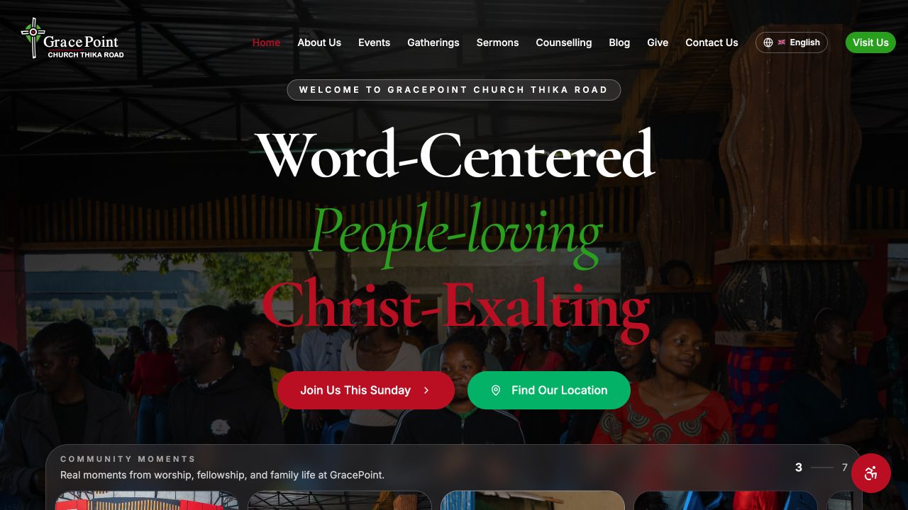
A church website serves two audiences at once: people deciding whether to visit and members returning for sermons, events, gatherings, counselling, and giving. Both groups needed to find the right next step quickly.
My approach
I shaped the navigation around real participation rather than internal structure. A distinctive, message-led hero establishes GracePoint’s identity, while visit and location actions sit alongside direct access to sermons, gatherings, events, counselling, and community stories.
The outcome
The result is a warm, media-rich church hub that helps a newcomer plan a Sunday and gives the wider congregation one dependable place to reconnect with teaching and church life.
Design journey
How first-visit uncertainty and returning-member needs became a welcoming, participation-led church website.
Listen for what a newcomer needs before arriving on Sunday.
Internal church structure is not the visitor’s mental model.
Organise navigation around visit, watch, join, receive help, and give.
Prototype message, location, and participation routes together.
Check newcomer tasks separately from returning-member tasks.
Newcomer uncertainty and member recurrence were mapped as related but distinct needs.
The architecture prioritised visit, watch, join, receive support, and give.
Wireframes tested a message-led hero without hiding time, place, and next actions.
The final system supports changing sermons, events, stories, and community information.
The problem statement
A church website fails newcomers when it assumes familiarity, and fails members when sermons, events, gatherings, and support are scattered across internal ministry labels.
How might we…
What the experience audit found
Ministry names required prior knowledge to understand.
Label destinations by the visitor’s intended action.
Strong imagery often displaced service time, location, and visit details.
Pair emotional welcome with practical certainty.
Sermons and events lacked a clear next participation step.
Connect media to real community actions.
Who I designed for
32 · New to the area · Thika Road
The cautious first-time visitor
“I want to know what Sunday will feel like before I come.”
39 · Congregation member
The returning participant
“Give me one reliable place for sermons and what is happening next.”
Empathy map · Peter — the cautious first-time visitor
The emotional journey
Doing
Arrives through search or a shared link.
Thinking
“Who are they?”
Design opportunity
Distinct, welcoming promise
Doing
Checks service time and location.
Thinking
“Can I get there?”
Design opportunity
Immediate logistics
Doing
Explores beliefs, people, and messages.
Thinking
“Could this be my community?”
Design opportunity
Human, jargon-free context
Doing
Reviews visit details and family needs.
Thinking
“I know what to expect.”
Design opportunity
First-visit guidance
Doing
Visits, watches, joins, or asks for help.
Thinking
“There is a clear next step.”
Design opportunity
Action-led pathways
Walkthroughs & iteration
FoundNewcomers went to About before locating visit details.
FixedMade time, place, and visit planning a primary route from the first viewport.
FoundMinistry labels were meaningful mainly to existing members.
FixedReframed navigation around participation and supplied context beneath church-specific names.
FoundSermon pages ended after playback.
FixedAdded related messages and routes into gatherings, counselling, and upcoming events.
Designed to move
Increase successful access to service time, location, and first-visit guidance.
Help members reach current sermons and events with fewer navigation steps.
Increase meaningful visit, gathering, counselling, and giving actions.
The mapped flow
Low fidelity → high fidelity
Research artifacts and wireframes are portfolio reconstructions based on the live experience and documented design rationale; they should be read as design evidence, not verbatim field-study records.
IT lead · UX/UI · Web development
Case study
The challenge
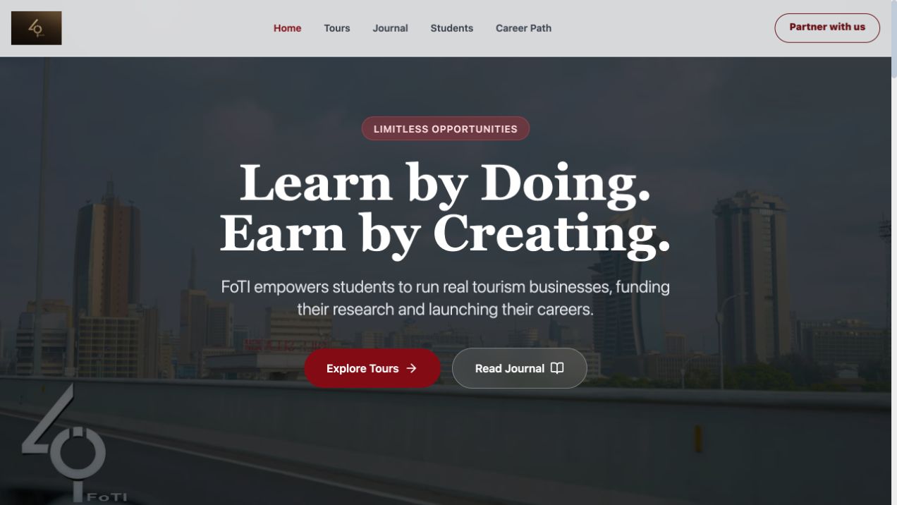
FoTI needed to speak clearly to students, universities, tourism partners, and travellers while showing how hands-on learning, tour experiences, research, and career development belong to one ecosystem.
My approach
I centred the story on a direct promise—learn by doing, earn by creating—then separated key journeys for tours, journal content, students, careers, and partners. The interface balances institutional credibility with the energy of travel and enterprise.
The outcome
The website gives FoTI a focused digital front door: prospective students can understand the model, partners can see how to participate, and visitors can move from the mission into real tours and stories.
Design journey
How a multi-audience institution became a clear ecosystem of learning, travel, research, and opportunity.
Understand the different proof students, partners, and travellers seek.
One broad mission needs distinct audience entry points.
Use learn by doing as the connective product story.
Prototype journeys before expanding institutional content.
Check whether each audience can identify value and a next action.
I documented what each audience brings, needs, and receives from the FoTI model.
Learn by doing and earn by creating became the spine connecting every pathway.
Structures tested how the homepage could orient visitors before showing depth.
The final system gives tours, journal content, careers, and partnerships room to grow.
The problem statement
FoTI’s model is difficult to grasp when education, tours, research, careers, and partnerships appear as separate initiatives instead of one practical pathway from learning to opportunity.
How might we…
What the experience audit found
Institutional sites led with broad purpose before clarifying what a visitor could do.
Lead with value and participation, then deepen the mission.
Student, partner, and traveller content competed in one navigation level.
Create explicit audience routes around shared proof.
Research and partnerships appeared as logos or claims disconnected from activity.
Show credibility through tours, stories, outputs, and pathways.
Who I designed for
20 · Tourism student · Nairobi
The opportunity seeker
“Show me how this learning becomes real work.”
46 · University partner
The evidence-led collaborator
“I need to see the model, outputs, and role for my institution.”
35 · Responsible traveller
The experience buyer
“I want a meaningful local experience I can trust.”
Empathy map · Carol — the opportunity seeker
The emotional journey
Doing
Encounters FoTI’s central promise.
Thinking
“What is different here?”
Design opportunity
Memorable value proposition
Doing
Chooses student, partner, or traveller route.
Thinking
“Where do I fit?”
Design opportunity
Audience pathways
Doing
Reviews tours, stories, research, or careers.
Thinking
“Is the model active?”
Design opportunity
Evidence through activity
Doing
Connects learning, creation, and earning.
Thinking
“Now the pieces make sense.”
Design opportunity
Ecosystem narrative
Doing
Applies, partners, reads, or books.
Thinking
“I know my next step.”
Design opportunity
Role-specific actions
Walkthroughs & iteration
FoundVisitors understood individual programs but missed how they connected.
FixedAdded a simple learn, create, earn pathway that recurs across sections.
FoundThe homepage tried to speak to every audience at once.
FixedIntroduced distinct student, partner, and traveller routes under one shared promise.
FoundInstitutional copy outweighed visible activity.
FixedBrought tours, journal stories, and pathways forward as evidence of the model.
Designed to move
Increase the share of visitors who can explain how learning connects to opportunity.
Increase progression into the correct student, partner, traveller, or journal path.
Increase relevant applications, partnership enquiries, reading, and tour discovery.
The mapped flow
Low fidelity → high fidelity
The research package is an illustrative reconstruction of the strategy behind the live platform. Success measures are intended outcomes and are not presented as measured performance.
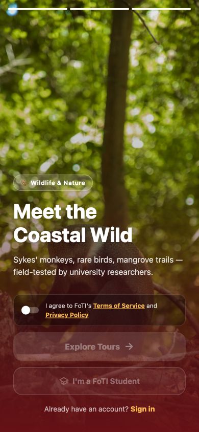
Product design · React Native · Marketplace architecture

Case study
The challenge
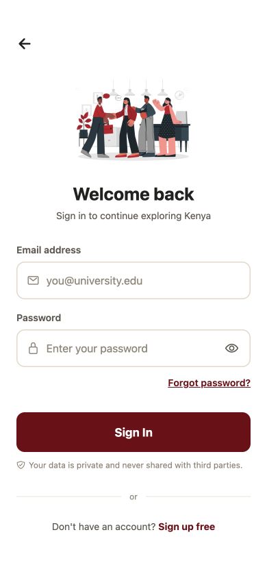
FoTI Tours serves three connected audiences with very different needs. Travelers need discovery, trust, booking, communication, and payment; students need tools to create tours, prove their research, manage bookings, and earn; lecturers need a dependable approval and quality-control workflow.
My approach
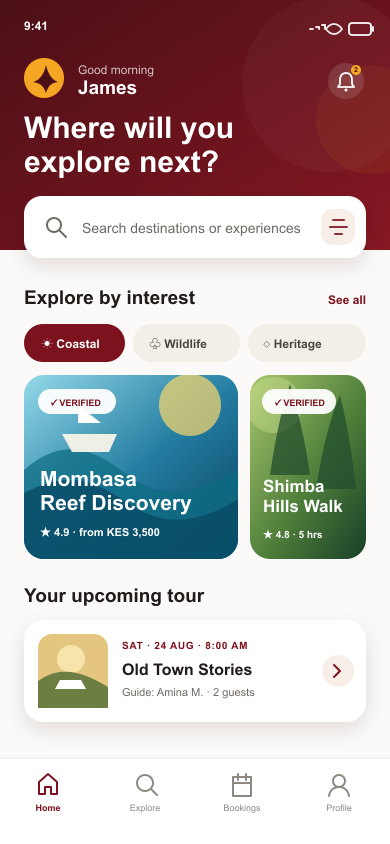
I designed the product as a role-based service ecosystem. Travelers move from destination discovery into verified tour detail, booking, M-Pesa payment, messaging, and reviews. Student guides use a five-step tour builder with itinerary, pricing, documentary, and academic-publication requirements. Lecturer approval keeps every live experience academically grounded.
The outcome
The v1.0 React Native product connects traveler, student, lecturer, and administrator journeys in one marketplace. Firebase supports real-time profiles, listings, bookings, messages, and approvals, while the student dashboard connects earnings and fieldwork to FoTI’s wider career pathway.
Design journey
How traveller trust, student enterprise, and lecturer approval were joined in one role-based marketplace.
Understand where the needs of travellers, students, and lecturers intersect.
Trust depends on visible academic quality and dependable marketplace operations.
Design three role journeys around one verified tour object.
Prototype role selection, publishing, booking, payment, and approval states.
Walk the handoffs where one role blocks another.
Traveller, student, lecturer, and admin needs were traced around one tour lifecycle.
Tour creation, approval, discovery, booking, and completion became a shared state model.
Low-fidelity flows focused on entry, builder completion, review, payment, and messaging.
A unified mobile system adapts actions and information to each role without fragmenting the product.
The problem statement
A student-led tourism marketplace cannot earn trust if travellers cannot verify quality, students cannot translate research into bookable products, and lecturers cannot review work without becoming an operational bottleneck.
How might we…
What the experience audit found
Standard tour platforms relied on ratings without explaining local or academic provenance.
Make verification and research visible in the listing.
Hosts were expected to create sellable tours from an open form.
Guide students from itinerary to evidence and pricing.
Review happened backstage with little status context for creators.
Expose approval stage, feedback, and resubmission.
Who I designed for
22 · FoTI student · Mombasa
The emerging guide
“Help me turn my fieldwork into something people will book.”
34 · Domestic traveller · Nairobi
The trust-seeking traveller
“I want something authentic, but I need to know it is dependable.”
48 · Tourism lecturer
The academic reviewer
“I need enough evidence to approve well, without rebuilding the tour.”
Empathy map · Zuri — the emerging guide
The emotional journey
Doing
Selects a traveller or student role.
Thinking
“This path is for me.”
Design opportunity
Clear role promise
Doing
Builds itinerary, pricing, and evidence.
Thinking
“Guide me through the standard.”
Design opportunity
Five-step builder
Doing
Submits for lecturer approval.
Thinking
“What happens now?”
Design opportunity
Visible review status
Doing
Traveller evaluates a verified tour.
Thinking
“Can I trust this experience?”
Design opportunity
Research and verification proof
Doing
Selects date, pays with M-Pesa, and messages.
Thinking
“My place is secure.”
Design opportunity
Clear booking states
Doing
Meets the guide and completes the tour.
Thinking
“This feels authentic.”
Design opportunity
Useful pre-trip details
Doing
Reviews the tour and tracks earnings.
Thinking
“This builds my pathway.”
Design opportunity
Feedback and career signals
Walkthroughs & iteration
FoundRole selection described permissions but not the value of each path.
FixedRewrote entry cards around what travellers and students can accomplish.
FoundStudents reached review with incomplete academic evidence.
FixedAdded completion criteria and a staged checklist inside the tour builder.
FoundTravellers wanted proof before reaching payment.
FixedMoved guide verification, research context, meeting details, and policies into tour evaluation.
Designed to move
Increase complete first-time tour submissions entering lecturer review.
Increase progression from verified tour detail into date selection and payment.
Reduce avoidable review cycles with visible standards and actionable feedback.
The mapped flow
Low fidelity → high fidelity
Personas, empathy mapping, audit findings, walkthroughs, and low-fidelity frames are reconstructed from the documented v1.0 product rationale. Measures state intended movement, not observed analytics.
UX/UI design · Mobile product · Sales workflow
Case study
The challenge
Field agents need to capture sales while the details are fresh, attach product and invoice evidence, verify delivery, and understand daily sales and commission without depending on a desktop back office.
My approach
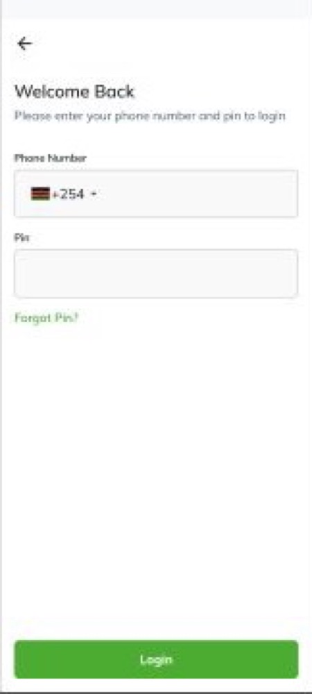
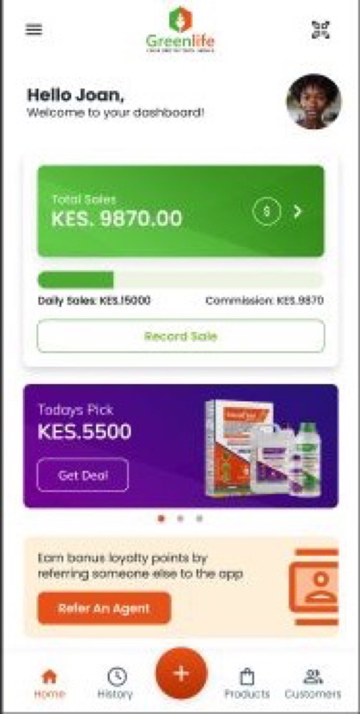
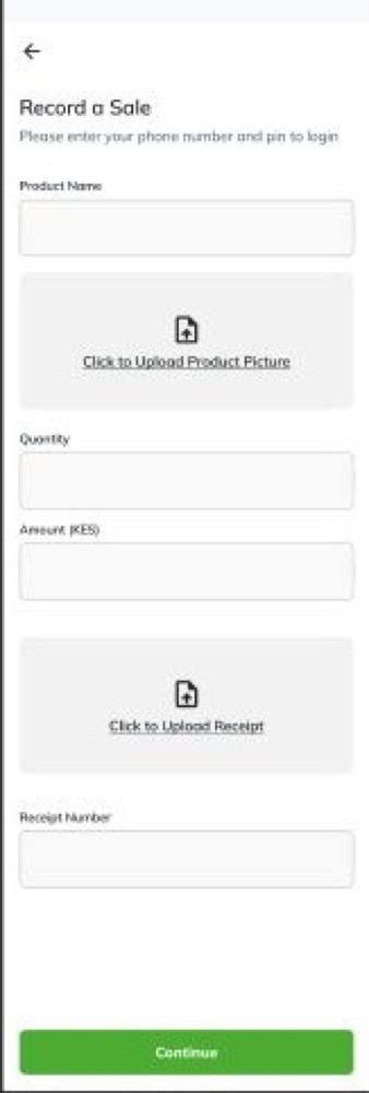
I organised the app around a short phone-and-PIN entry, an at-a-glance performance dashboard, and one guided record-sale flow. Product photos, invoice uploads, quantities, amounts, delivery confirmation, sales history, and password recovery stay close to the agent’s main task.
The outcome
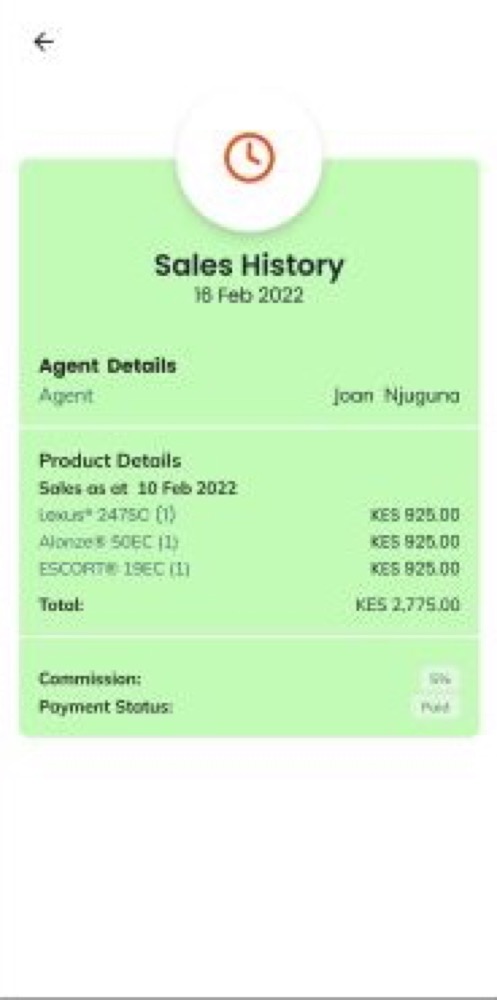
The resulting mobile concept connects day-to-day selling with the evidence and feedback agents need: a live sales overview, structured transaction capture, confirmation details, visible commission status, and a recoverable sign-in journey.
Design journey
How a field agent’s daily sales work became one mobile loop from secure entry to recorded, evidenced, and confirmed delivery.
Follow what an agent needs before, during, and after recording a sale.
The core problem is not data entry alone—it is proving the transaction and seeing its value.
Connect performance, capture, evidence, history, and recovery around one repeatable task.
Prototype the shortest reliable sale-recording path before adding secondary features.
Walk through weak connectivity, missing proof, corrections, and forgotten-PIN scenarios.
I mapped what an agent knows, captures, and needs to verify while still with the customer.
Dashboard, record sale, proof uploads, confirmation, history, and access recovery became one connected model.
The prototype tested large touch targets, short forms, upload clarity, and a scannable confirmation state.
Greenlife’s colour system separates performance, offers, actions, and successful completion without crowding the small screen.
The problem statement
Field sales agents lose time and confidence when sales totals, commission, product evidence, invoices, and delivery confirmation are split across manual records or disconnected tools.
How might we…
What the experience audit found
Sales tools often mirrored desktop databases with long, dense mobile forms.
Sequence fields around the real sale conversation.
Product and invoice evidence was collected separately from the transaction record.
Capture proof inside the same guided flow.
Dashboards displayed numbers without connecting them to recent sales or commission status.
Pair performance with clear next actions and history.
Who I designed for
29 · Field sales agent · Central Kenya
The on-the-move recorder
“I need to finish the record before I leave the customer.”
41 · Regional sales supervisor
The evidence-led reviewer
“A total only helps if I can trace the sale behind it.”
Empathy map · Joan — the on-the-move recorder
The emotional journey
Doing
Uses a phone number and PIN to access the app.
Thinking
“Get me back to work quickly.”
Design opportunity
Short, recoverable access
Doing
Reviews daily sales, total sales, offers, and commission.
Thinking
“How am I doing today?”
Design opportunity
Actionable dashboard hierarchy
Doing
Adds product, quantity, amount, and description.
Thinking
“Keep this fast and complete.”
Design opportunity
Guided field sequence
Doing
Uploads product and invoice images.
Thinking
“Is this evidence clear enough?”
Design opportunity
Visible upload status
Doing
Reviews agent, product, totals, commission, and payment status.
Thinking
“Everything matches.”
Design opportunity
Single confirmation summary
Doing
Returns to previous sales and status.
Thinking
“I can trace what happened.”
Design opportunity
Searchable, status-aware history
Walkthroughs & iteration
FoundAgents could reach confirmation without being sure both product and invoice proof had uploaded.
FixedAdded distinct upload areas and made evidence status part of completion readiness.
FoundThe dashboard numbers drew attention but did not make the next task obvious.
FixedKept a prominent record-sale action alongside performance and recent activity.
FoundA forgotten PIN created a support dead end.
FixedAdded a three-state reset path with verification, new PIN entry, and explicit success.
Designed to move
Increase sales submitted with the required product and invoice evidence on the first attempt.
Reduce the time and repeated effort required to record a sale in the field.
Improve visibility of daily performance, commission, delivery, and payment status.
The mapped flow
The personas, audit findings, empathy map, walkthroughs, and measures are portfolio reconstructions based on the visible Greenlife prototype. They describe design intent rather than verified production research or analytics.
Campaign design · Brand communication · Digital marketing


Case study
The challenge
Recruitment services are process-heavy, but social audiences decide in seconds. The campaign needed to explain the value to employers quickly, feel recognisably Kenyan, and make the phone response path impossible to miss.
My approach
I combined bold brand orange, human expressions, short service checklists, and high-contrast calls to action. The second route uses bilingual English and Kiswahili copy to add familiarity while keeping sourcing, screening, checks, and onboarding clear.
The outcome
The two coordinated creatives give Stellar HR a flexible campaign system for direct-response social posts: one process-led route and one conversational route, both designed around a clear contact action.
Design journey
How an employer’s split-second social scan became a clear recruitment-service proposition and response path.
Understand what an overwhelmed employer notices in a social feed.
A process-heavy service needs one immediate promise and one immediate action.
Explore process-led and conversational bilingual message routes.
Prototype hierarchy at real feed size, not only on a large canvas.
Check comprehension, brand recall, and contact visibility in seconds.
The campaign was framed around the work a hiring owner needs removed, not an agency’s internal process.
A process-led route and a bilingual conversational route shared the same promise and action.
Layouts were evaluated as mobile-feed creative so hierarchy survived real viewing conditions.
The final pair uses consistent colour, human imagery, proof, and contact rhythm.
The problem statement
Employers scroll past recruitment support when a campaign tries to explain the entire hiring process before making the value, local relevance, and response action immediately clear.
How might we…
What the experience audit found
Recruitment ads presented long capability lists at equal visual weight.
Prioritise the promise, then supporting proof.
Generic corporate imagery made competing services visually interchangeable.
Use expressive, locally resonant human cues.
Contact details were present but visually subordinate to the service copy.
Design the CTA as the final reading beat.
Who I designed for
37 · SME operations manager · Nairobi
The overloaded hiring owner
“Tell me what you will take off my plate.”
45 · Business owner · Kiambu
The trust-first decision maker
“I want a local team I can call and understand quickly.”
Empathy map · Faith — the overloaded hiring owner
The emotional journey
Doing
Notices the creative in a busy feed.
Thinking
“Is this relevant to me?”
Design opportunity
Bold brand and human expression
Doing
Reads the core recruitment promise.
Thinking
“What do they handle?”
Design opportunity
Short service hierarchy
Doing
Recognises local language and hiring pain.
Thinking
“They understand my context.”
Design opportunity
Familiar phrasing
Doing
Calls, saves, shares, or messages.
Thinking
“I know how to start.”
Design opportunity
Dominant direct-response CTA
Walkthroughs & iteration
FoundAt feed size, the full service list competed with the headline.
FixedReduced the checklist and increased contrast between promise, proof, and CTA.
FoundThe process-led route felt clear but less conversational.
FixedCreated a coordinated bilingual route for familiarity without losing service scope.
FoundPhone contact was readable on canvas but weak in a mobile preview.
FixedPromoted it into a high-contrast final band with more breathing room.
Designed to move
Increase accurate recall of the recruitment-support offer after a short feed exposure.
Increase qualified calls, messages, saves, and shares from target employers.
Maintain recognisable brand and CTA hierarchy across campaign variants.
The mapped flow
The audience research, audit, empathy map, walkthroughs, and journey map are portfolio reconstructions of the campaign rationale. Measures describe intended campaign movement, not reported results.
I don't just launch campaigns. I design the whole path from attention to action — audience, offer, creative, landing page, and follow-up — then measure it and make it better.
Meta and TikTok campaigns built from a clear audience and offer through to creative, retargeting, and budget pacing.
Creator selection on audience fit rather than follower count, briefs that protect the brand message, and tracked collaborations that carry through to a measurable action.
Intent-led search, Performance Max, and shopping structured around the queries customers actually use.
Technical, on-page, and content work that earns durable visibility in organic search.
Answer engine optimisation — structuring expertise so AI answer systems like ChatGPT, Perplexity, and Google AI can find, understand, and cite it.
Onboarding, nurture, re-engagement, and win-back flows that move people toward a real next step.
Message-matched landing pages and conversion testing — the post-click experience, not just a prettier button.
Event tracking, attribution within its honest limits, and reporting that informs the next decision.
How I approach growth
Define who we are talking to, the job they are trying to do, and the single promise worth leading with.
→Translate the promise into scroll-stopping creative and copy that carries one clear idea per campaign path.
→Match the landing experience to the ad, remove friction, and make the intended action impossible to miss.
→Connect spend to qualified action, learn from what the data and customers say, then improve the whole chain.
Where I've run it
Brand, web, and campaign assets built to carry a clear message all the way through to conversion.
Growth for a multi-branch dental group: local search visibility, content, and appointment-focused campaigns.
Social and content strategy across an education-and-tourism platform, connecting audiences to real experiences.
I write about the thinking behind this in the journal — from product thinking for marketing to local SEO and AI discovery.
The range to see the system. The craft to improve the screen.
I’m Joshua Nguku, a Nairobi-based UI/UX and product designer and digital marketing manager with frontend development experience. My strength is connecting disciplines that are often separated: user flow, interface detail, technical feasibility, content, and conversion.
My background in ecotourism and hospitality management trained me to think in services, people, and context. I now apply that lens to financial products, healthcare, education, tourism, and community platforms.
User journeys, product requirements, information architecture, service flows, and usability thinking.
Wireframes, high-fidelity UI, responsive systems, prototypes, components, and edge states.
Production-minded frontend craft that preserves design intent across screen sizes and states.
SEO, campaign design, lead nurturing, content systems, and conversion-aware digital strategy.
Selected credentials
Gestalt Psychology & Web Design · Front-End Web Development · Perception & Memory in HCI/UX · Web Design for Usability · UX Management: Strategy & Tactics
From fintech product journeys and tourism platforms to healthcare growth and recruitment campaigns, every role has strengthened the bridge between user clarity and business action.
Download full CVDigital Marketer
Information Technology Lead · Social Media Manager
UI/UX Designer
Integrated Marketing & Design Executive
Digital Marketing Assistant
Frontend Development
Open to product design, UI/UX, frontend, and digital experience roles